Adelaide CAD wanted to create a brand that reflected ‘master craftsman’ or ‘oral architects’ and reflected their brand values – integrity, respect, trust and collaboration.
When creating the logo we were requested to take into the account the practice name. The name AdelaideCAD was partly chosen to link back to the CAD/CAM or computer-aided design and manufacture that is becoming the norm in dentistry, particularly prosthodontics.
They wanted their name to be associated with a practice which utilises CAD/CAM technologies in their treatment, particularly computer-aided design.
Creation of a brand strategy to identify brand positioning statements, messaging, tone and value proposition;
Creation of logo (all formats – online and print)
Creation of secondary logo – the symbol associated with their business (all formats)
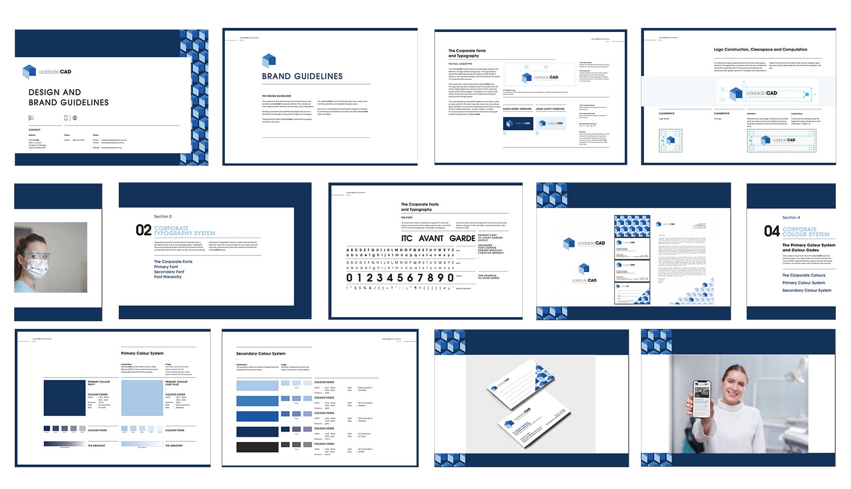
Branding style guide – including fonts, logo specifications and imagery
Creation of stationery (business cards)
To align Adelaide CAD’s branding with ‘Master Craftsman’ and ‘Oral Architects’, we created a logo with an architecture feel that is derived from the CAD program itself.
To link back to the 3D visual cues for the business, we further developed the concept by creating an ‘elevated’ symbol for the logo.
The blue and grey colour palette was chosen for the master craftsman feel. Blue also signifies trust, dependability and strength, while grey signifies balance and calm which were all important brand traits for Adelaide CAD.

The end result, a brand that:

Our regular newsletters are the ideal way to build your marketing knowledge and grow your healthcare business.