They say you never get a second chance to make a first impression.
That makes your visual brand identity extremely important. Your logo, colour palette, typography, imagery and design choices play a crucial role in shaping how patients, referrers, partners or procurement teams see your brand.
In a competitive and highly regulated industry like healthcare, looking polished isn’t a vanity metric. It’s a key part of establishing trust and differentiation in healthcare. Consistent, strategic visual branding helps you stand out, build recognition, and create emotional resonance across every touchpoint, from your website to your packaging, signage and social media.
Why visual branding matters
In the healthcare sector, brand perception is tightly linked to trust, credibility and patient experience.
“Branding isn’t an add‑on to your marketing strategy. For it to work, it has to be part of everything you do.”
A visual identity that aligns with your values, supports your service promise and is applied consistently across all touch‑points is essential for patient acquisition and loyalty.
The power of colour: colour psychology for branding
Colour is one of the most powerful non-verbal tools in your branding toolkit. It influences how people feel about your business before they’ve read a single word. In healthcare, where trust, clarity and reassurance are critical, the colours you choose can either reinforce your credibility – or subtly undermine it.
“Colour psychology has long been a powerful marketing tool…Do you want your online presence to convey trust, serenity, or authority? Colour is one way to help craft that image.”
Whether you’re trying to calm anxious patients, inspire confidence in referring partners, or energise buyers at a trade show, understanding colour psychology ensures your brand is working with the human brain, not against it.
You might be surprised to learn that colour:
- Can increase brand recognition by up to 80%
- Influences 90% of impulse buys
- Accounts for 93% of your brand’s visual appearance.
In healthcare branding, colour choices matter not only for aesthetics but for patient comfort, clarity and trust.

Why brand guidelines matter
Once you’ve created a visual brand identity, you need to apply it consistently at every touchpoint or you risk undermining your professional credibility.
Brand guidelines matter because they promote consistent use of fonts, colour, iconography and layouts across multiple platforms. They form the blueprint that ensures your visual identity remains coherent, recognisable and trusted.
Our process for building your visual brand identity
Here’s how Splice Marketing guides healthcare businesses through a structured, strategic approach to visual identity.
Discovery and brand articulation
We begin by exploring why you exist, how you are different, and what outcomes you deliver. We capture your unique positioning and translate that into adjectives, values and a brand personality.
Colour strategy and mood‑boarding
The next step is defining your colour palette, informed by colour psychology, for branding and your brand personality. We present options and discuss how those colours are likely to make your audience feel.
Logo, typography and iconography design
Here we apply the colour palette, develop logo concepts (wordmark, icon, logotype), select typefaces, and create iconography that works across digital, print, uniforms, vehicle decals and signage, depending on your needs. Practical considerations like legibility in black and white, scaling for embroidery and vehicle wraps are built in.
Brand guidelines and visual identity system
Once the identity is approved, we develop a comprehensive guidelines document that may include:
- Colour codes (HEX/RGB/CMYK)
- Logo usage rules
- Typography rules
- Imagery style
- Tone of voice for visuals
- Spacing
- Acceptable/unacceptable versions.
Any staff, freelancers or contractors working for you need to follow these brand guidelines. They’re a key document for your business.
Activation across touchpoints
Finally, we roll out the identity across all brand touchpoints: website, social media templates, patient forms, signage, uniforms, and marketing collateral. We ensure consistent application because visual branding works best when applied everywhere.
Ongoing governance and audit
Brand consistency matters especially in healthcare. We recommend periodic audits of design usage, internal training for staff, and version control so that team members and external suppliers always apply the identity correctly.
Case studies: branding in action
Logo and brand‑identity development for MADIE
MADIE is a complete medication management system for aged care facilities.
Splice Marketing created a colour palette that combines blue tones to inspire trust, professionalism, stability, and intelligence with gold shades representing prestige, excellence, and innovation, strengthening the brand’s identity.
The process included:
- Articulating MADIE’s mission and patient‑centric values
- Developing a clean, distinctive icon and logotype that works in single colour, full colour and small scale
- Applying the new identity across letterhead, signage and digital collateral
- Ensuring immediate recognition and visual consistency across the brand ecosystem.
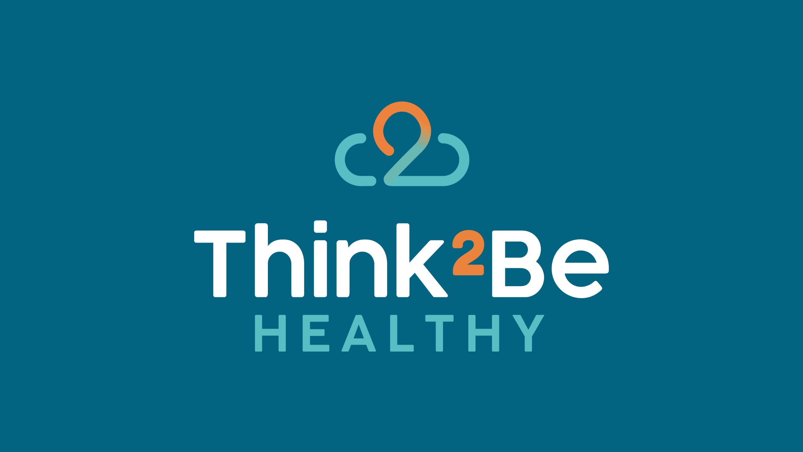
Refreshing Think2Be Healthy’s logo and visual identity
Think2Be Healthy combines leading-edge medical innovations with holistic therapies to create a nurturing environment where chronic illness, inflammation, and stress can be transformed into vitality, resilience and lasting well-being.
Splice Marketing:
- Completed a brand refresh, preserving brand equity while modernising the icon, colour palette and typographic system.
- Thoughtfully incorporated the icon across social templates, email footers, brochures and signage. This subtle but effective use of the icon helps tie everything together and reinforces your presence across every touch‑point.
- Delivered full brand guidelines and an activation roll‑out plan to ensure consistency and longevity.
For Think2Be’s new visual brand identity, we chose green tones to represent health, renewal and harmony, balanced by a touch of tangerine for warmth, energy, adventure, creativity and optimism.
Why all this matters for your healthcare brand
If you’re a clinic, specialist practice, allied‑health provider or health‑tech brand, investing in a strong visual brand identity means:
- Patients recognise you quickly and associate your work with quality, trust and clarity
- Your internal team and external suppliers have a clear reference (brand guidelines), which reduces “rogue” versions of designs that dilute the brand
- Your digital and physical touch‑points align, accelerating brand recall and differentiation in a competitive healthcare market
- You’re future‑proofing your brand – visual trends evolve, technology changes, and consistent identity means longevity.
Ready to transform your visual brand identity into a patient‑focused differentiation tool?


