Those who claim “A picture is worth a thousand words” may well be right. Your choice and consistent use of a colour palette and logo create a visual brand identity for your practice that builds recognition.
But how do you go about that? You can’t pluck colours at random or throw together a few shapes and call it a logo. It takes careful thought and considerable creative ability to create a visual brand identity that is an authentic reflection of your business.
Here’s how we go about it at Splice.
First, we listen
We listen to you describe your ‘why’ – not just what your practice offers but the particular way you do it and your reasons for that.
Our ears prick up when we hear you use certain words or synonyms repeatedly. One person might talk about wanting to help people experience a vibrant, joyful life, another might want to provide cutting-edge care using the latest new technology.
This is part of brand articulation – explaining who you are, what you do and why.
Then we use colour psychology
While you talk, we’re keeping track of keywords that you use to describe your business. Then we use colour psychology to create a selection of colour palettes for you to choose from.
Colour psychology explores how different colours influence perceptions, emotions and behaviour. It’s a powerful tool in marketing with Hubspot noting that:
- Up to 90% of an initial impression comes from colour
- 93% of consumers make purchasing decisions based on visuals alone
- Colour increases brand awareness and recognition by 80%.
So, how do colours influence people? It’s quite fascinating. Notice how big corporations pay attention to this stuff (and what lucrative rewards they reap for their efforts!).
Red
Movement, excitement, passion, urgency, energy, appetite

Blue
Trust, peace, security, reliability, maturity

Green
Relaxation, wellness, harmony, serenity, connection with nature
Yellow
Warmth, optimism, innovation
Orange
Creativity, confidence, energy

Black
Sophistication, security, power, elegance
Next, we translate
By this stage of the process, you’ve described your business and we’ve gained a clear idea of its values and personality. Now, we translate those words into symbols to create your logo and any accompanying typeface.
At Splice, we follow a staged process that involves:
- Selecting your colour palette – we present you with several options based on the keywords identified in earlier discussions
- Designing your logo – once your colour palette is agreed, we use it to create some logo options (a logo consists of an icon or symbol, a font type and a colour palette)
- Refinement – we talk through what you like, what you don’t like and why. Then we finesse your logo and colours to reach the final version.
There are some key things to consider here. Will your logo need to be printed on scrubs or uniforms as well as on brochures and letterheads? If you love an unusual colour – fluoro or metallic, for example – are you OK with the higher printing costs you’ll incur? Do you like how your logo looks in black and white as well as in colour?
We asked Cherie Buchanan, our fabulous head of design and production, how she brought all this together for two recent clients.
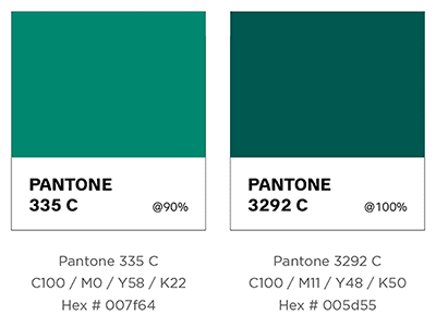
“Serenity Gastroenterology was interesting,” says Cherie. “Dr Sabanathan knew many patients felt anxious about having a colonoscopy and tended to put it off. He was keen to help people feel at ease, which was why he’d put ‘serenity’ right there in the name of his practice. So, I used soothing green tones and a simple sans-serif typeface. The icon reflects the letter ‘S’ in the negative space and the arms/hands convention creates a sense of comfort and care.”
![]()
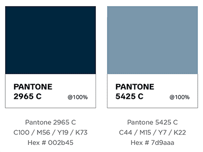
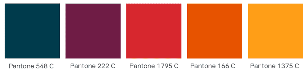
Another client was Altru Health, a telehealth service that provides counselling alongside movement therapies and holistic wellness practices.
“Altru Health wants to help people live their best life and overcome the things that are holding them back,” says Cherie. “So I create a palette of sunset tones to represent health, active living, energy, strength and vitality. Those colours were balanced by grey, representing neutrality and balance. The final result looks warm and hopeful.”
![]()
Finally, we lock it down and activate it
Your brand guidelines set out how your brand imagery is to be used – minimum sizes, set colours, how to use it stacked or in landscape. Adhering to these guidelines ensures your brand remains consistent wherever people encounter it.
Then comes activation! This is the exciting part, where you see your brand brought to life in your website, letterhead, social media tiles, car wrap, banner, signage, uniforms or wherever else you choose.
Ready to elevate your brand?
Creating a visual identity elevates your brand immensely. It makes your business look real, active and recognisable.
If you’d like help to bring your brand’s visual identity to life, then please get in touch. We’d love to work with you.